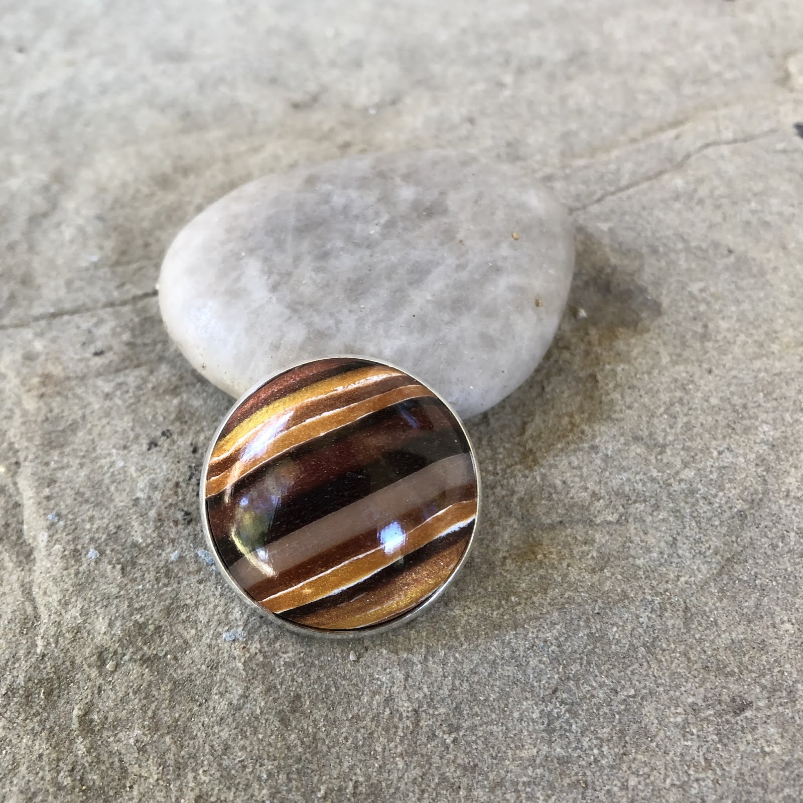
As I practice making polymer clay pieces it becomes obvious that you need not only to choose great colors but the lightness should have some contrast as well. I sometimes make a lovely color palette but the colors all blend in the piece because they are too similar in lightness. i.e. not enough dark vs light colors
Ecru (or beige) , turquoise and black - I just love how the ecru and turquoise create a green when blended. Check out the Jessama tutorial here

Navy, turquoise and bronze

Alizarin crimson, blush and white

In general terms I think you cannot go wrong if you choose a bright primary type color and then use a light neutral and a dark neutral. Here is my experiment with some scrap red, dark bronze and pearl mixed with a little bit of the bronze.